AESOP
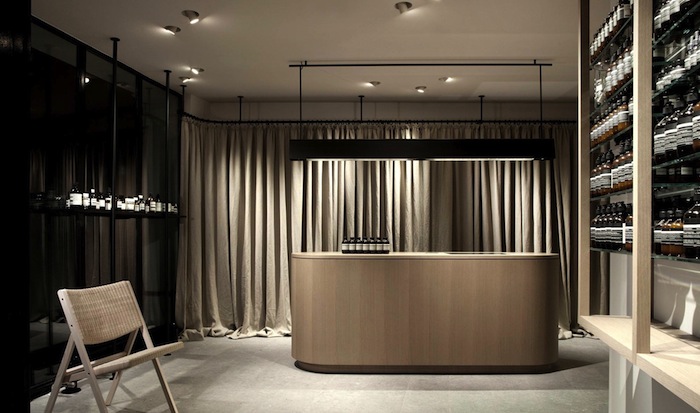
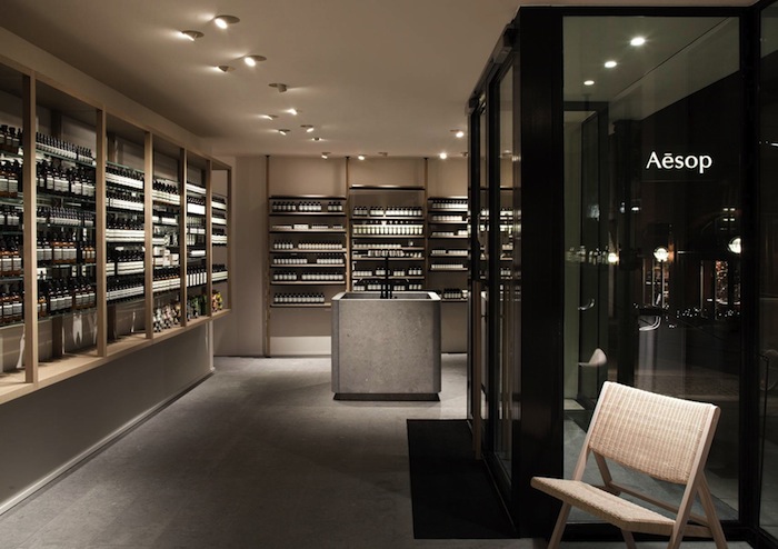
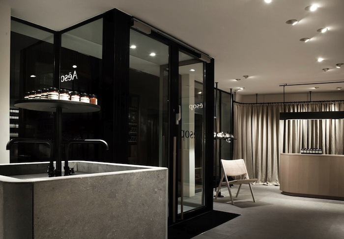
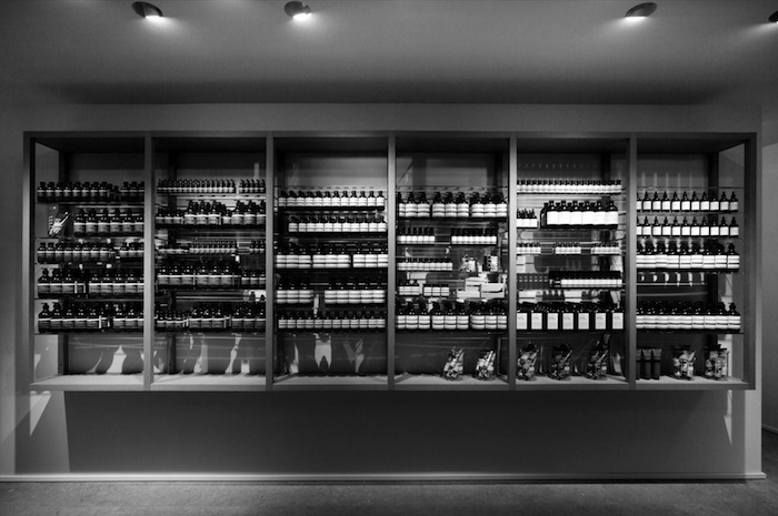
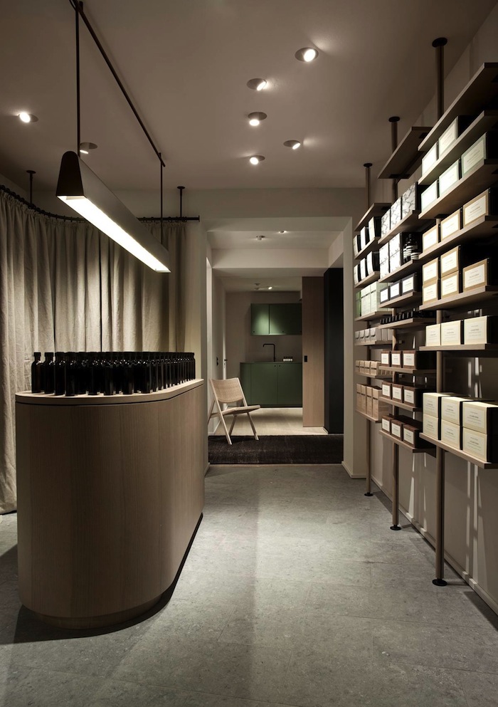
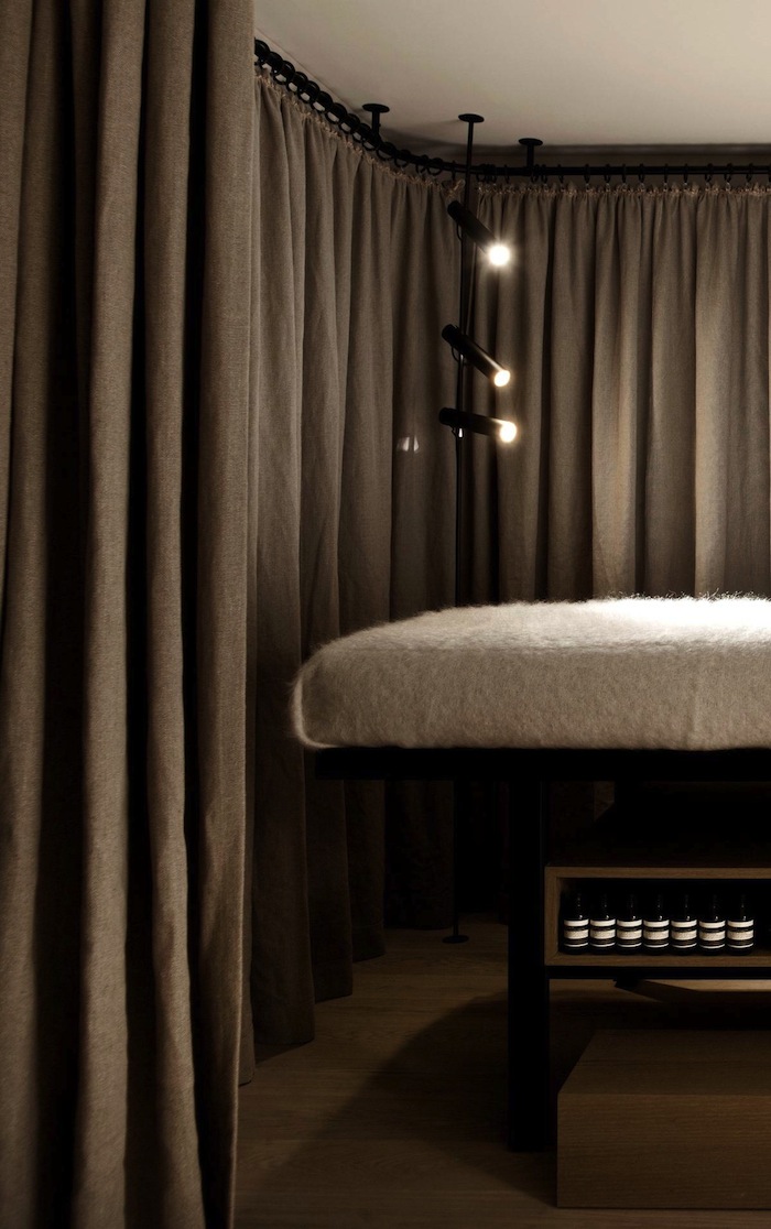
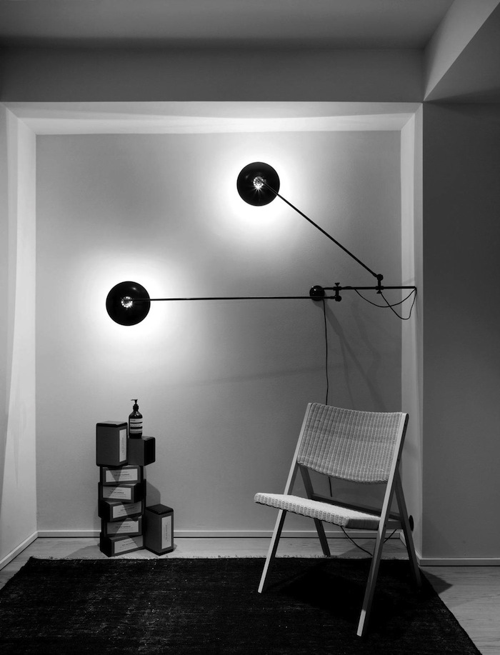
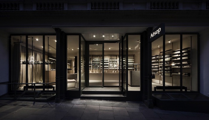
Those who love this brand know that it is a design triumph, from store front to product packaging. Aesop’s latest German signature store, and its first in Hamburg was created in collaboration with Vincent Van Duysen Architects and features the brand’s first facial treatment room in Europe. The design relies on simple, natural materials and a subtle palette.
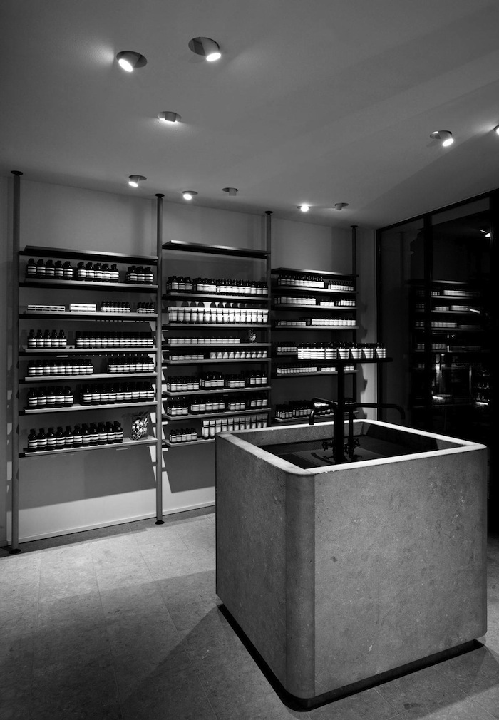
Walls and ceiling in this 112-square metre space have been stripped back to their original state and clad in pale, roughly textured plaster, providing a refined tactile element. A sink of solid bluestone, conceived as a sculptural element and evocative of ancient fountains, effects a commanding presence and emphasises the product demonstration experience integral to Aesop’s gracious hospitality. Bluestone is also used for flooring creating a serene and timeless setting.
From the moment you enter one of these stores you feel instantly detoxified and stimulated through the rich aroma on natural products.
 Images via Vincent Van Duysen, Photography by AESOP.





Thank You!
Your comment is awaiting moderation and will be displayed soon.